Elevating color selection: integrating analogous and complementary colors
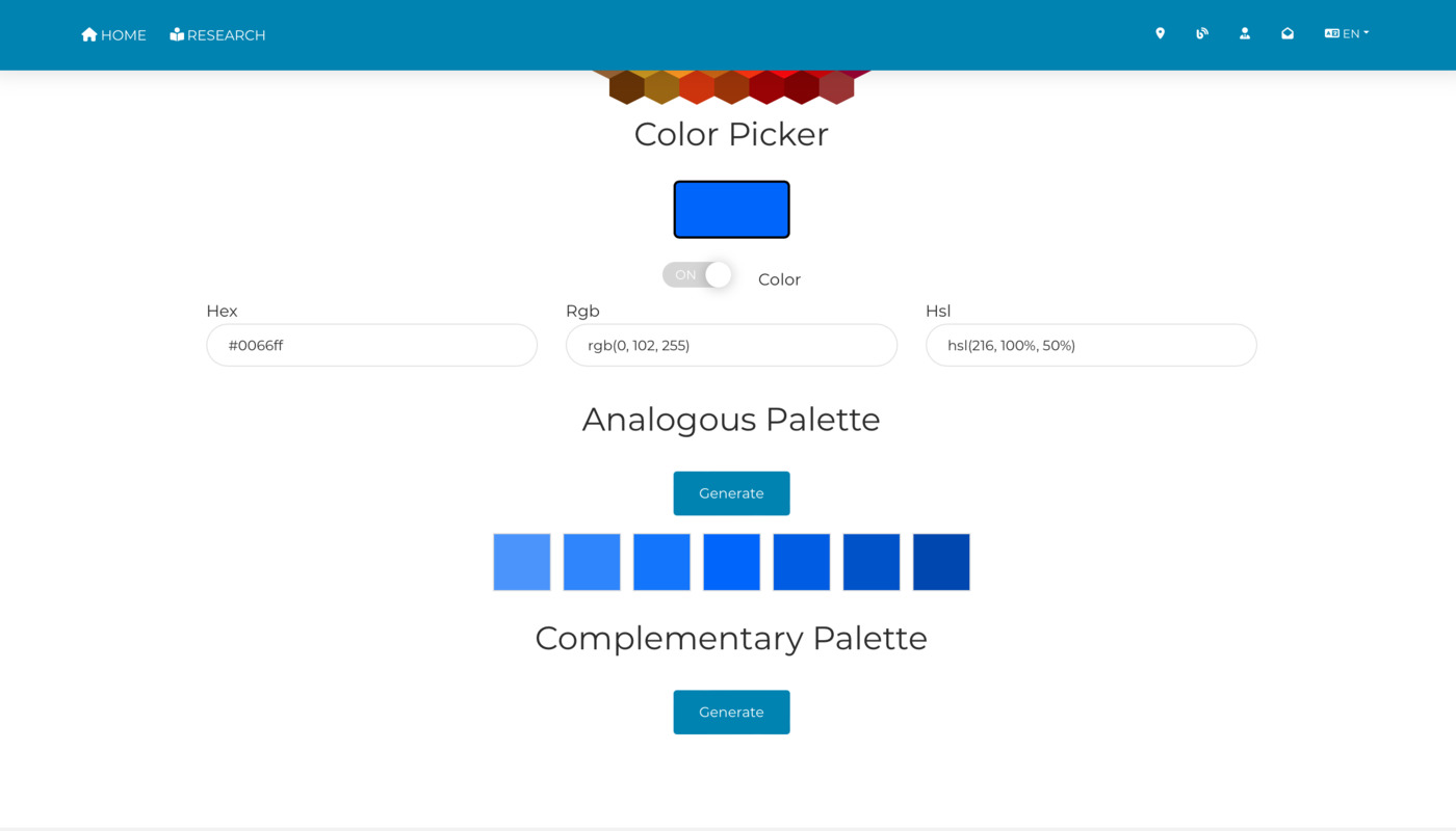
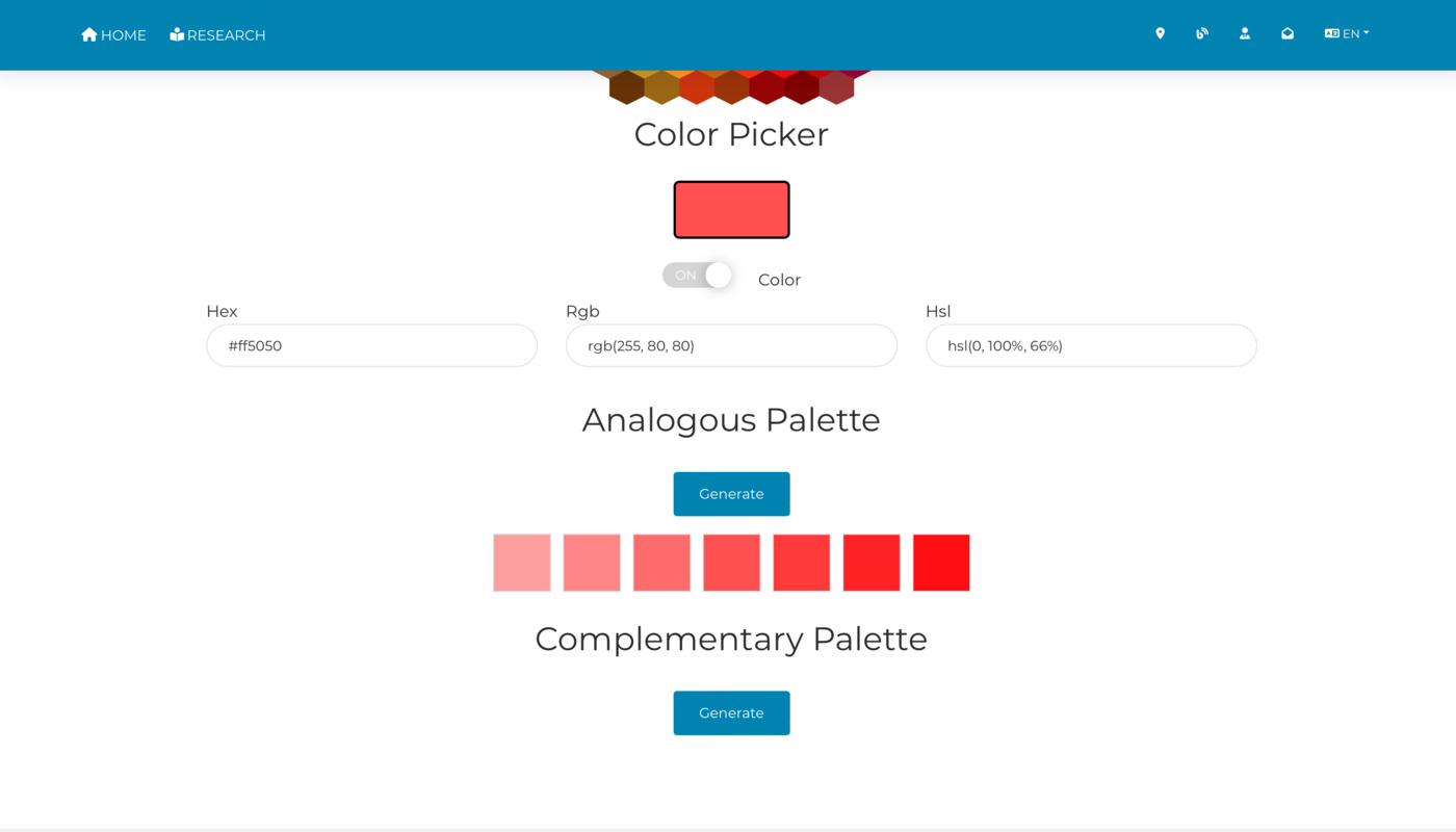
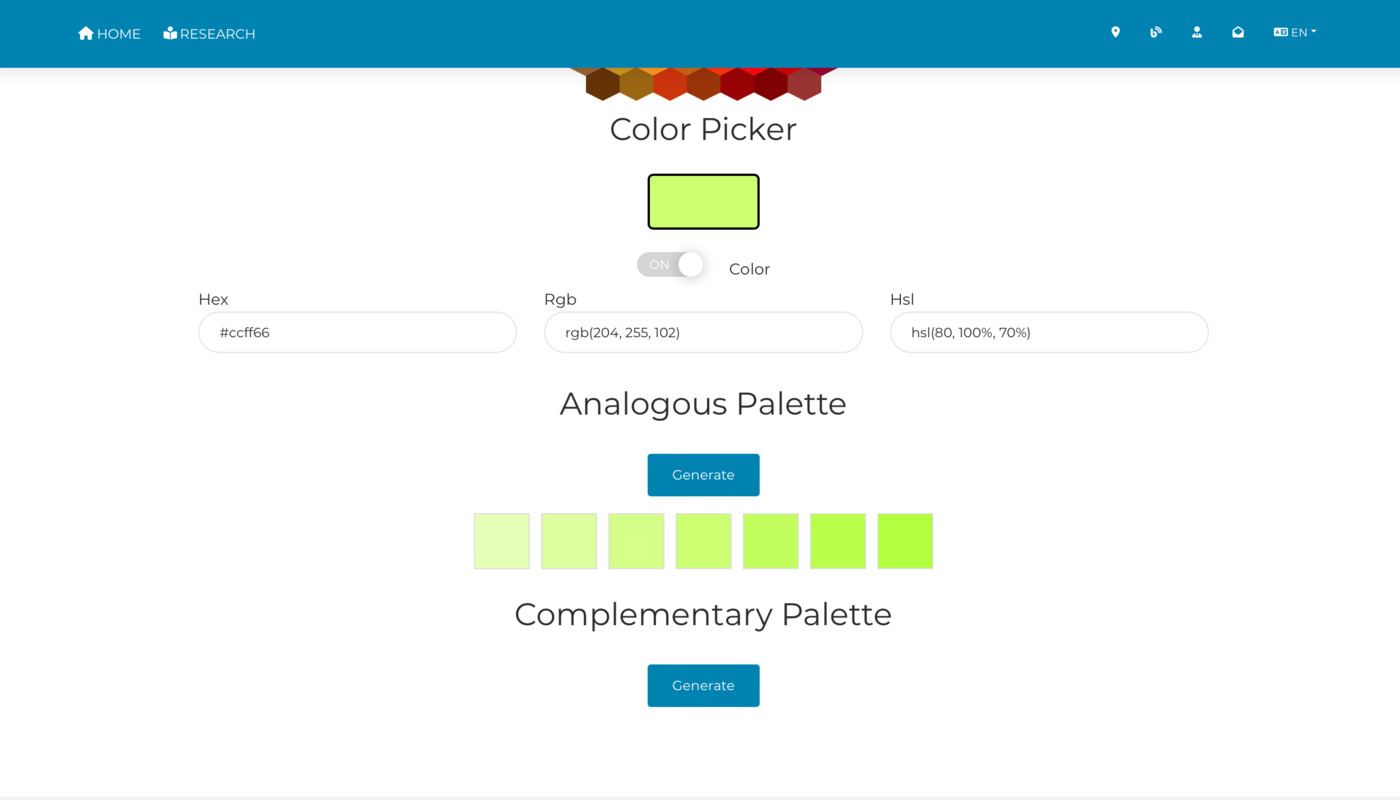
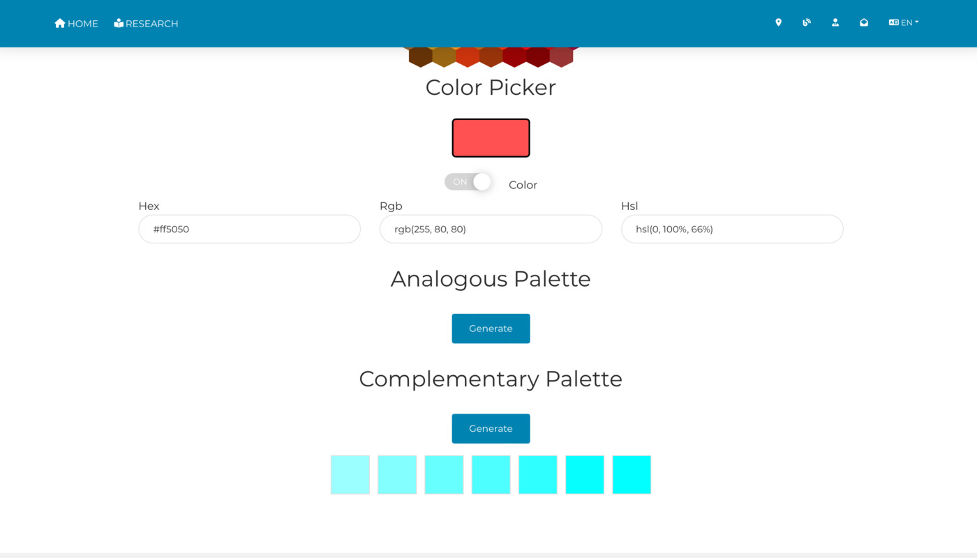
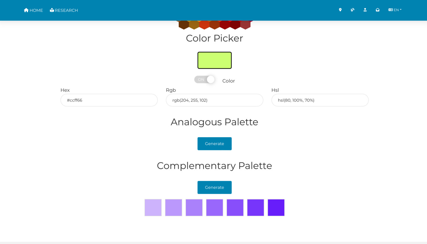
In our continuous quest to provide tools that empower creativity and efficiency, I am thrilled to unveil the latest update to my color picker tool. This enhancement introduces the integration of analogous and complementary color functionalities, offering an enriched user experience for color scheme selection.
Analogous colors: harmonious hues
Analogous colors are groups of three colors that are next to each other on the color wheel, sharing a common hue, with one being the dominant color, which tends to be a primary or secondary color, and a tertiary. This update makes selecting harmonious colors not just intuitive but also visually appealing, aiding in the creation of soft and serene color schemes that are perfect for various design projects.
Complementary colors: dynamic contrasts
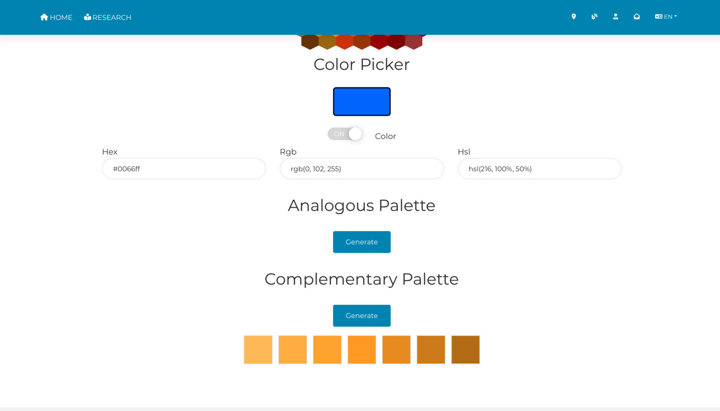
Complementary colors are pairs of colors that, when combined, cancel each other out. This means they are on opposite sides of the color wheel, providing the highest contrast and vibrant look when used together. My tool now effortlessly displays the complementary color to your selected hue, enabling the easy creation of dynamic and bold color palettes.
Experience the update
Explore the enhanced color picker tool and explore a world where selecting the perfect color scheme is only a click away. Whether you’re designing a serene landscape or looking to inject vibrancy into your artwork, my tool’s new features have got you covered.
We’re eager to see the amazing projects you’ll create with this update. Remember, great design starts with the right color!
