Customizing Hexo sidebar
In my quest to personalize my Hexo blog, I embarked on a journey to customize the sidebar to better align with my aesthetic preferences and functional needs. This post outlines the steps I took, the challenges I encountered, and the solutions I devised.
Initial layout
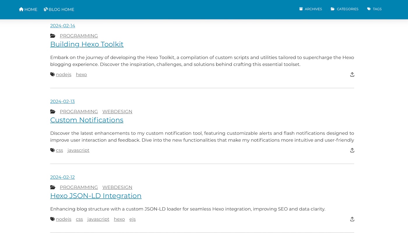
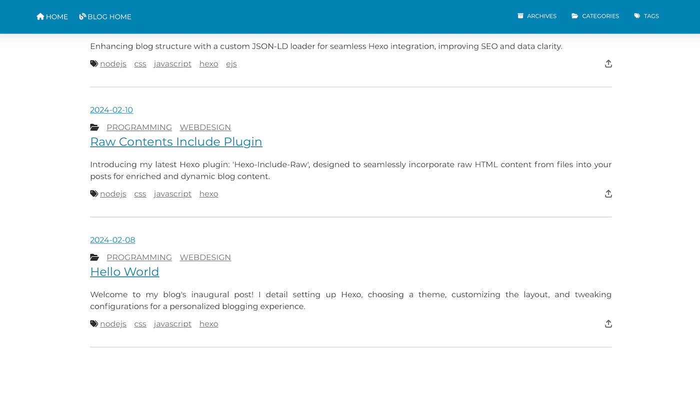
The blog is fairly recent so I did not had any sidebar.
Customization steps
Categories and tags
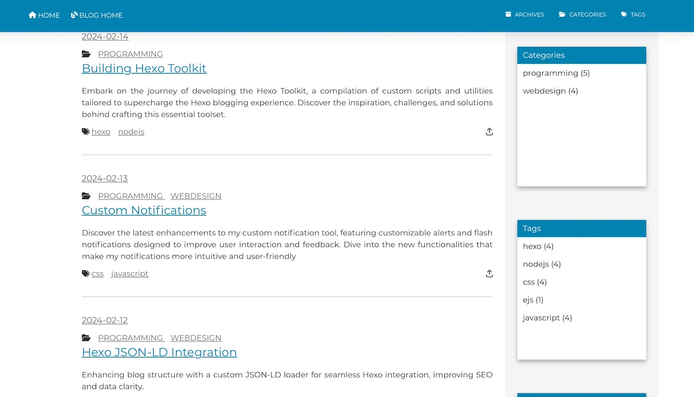
I started by adding categories and tags sections to the sidebar. Each section was designed to list items in a clean, organized manner, with a slight gray background to differentiate the sections from the main content area.
Recent posts and archives
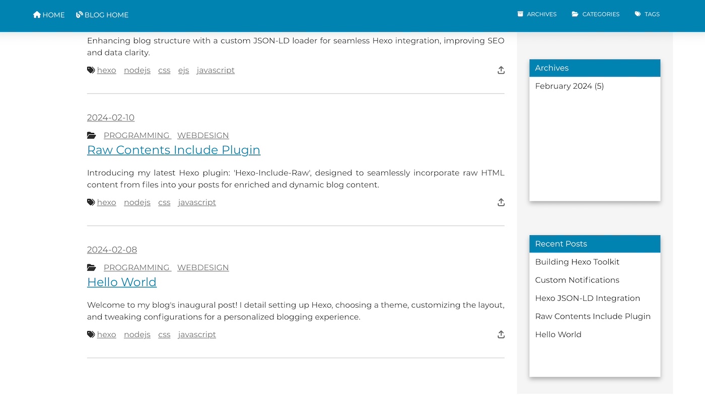
Next, I added a recent posts section to highlight the latest content on my blog, followed by an archives section, which was organized by month and year for easy navigation.
Styling adjustments
To ensure visual consistency, I applied custom CSS styles across all sidebar sections. This included setting a fixed height, adding a light border and shadow to create depth, and adjusting margins for a cleaner layout.
Challenges and solutions
One of the main challenges was ensuring the sidebar content did not exceed the available space, which was resolved by setting a fixed height with scrollable content areas. Another challenge was the dynamic generation of archive links, which required a bit of EJS logic to group posts by date.
Next steps
The customization process not only enhanced the sidebar’s visual appeal but also improved site navigation, making it easier for visitors to explore different categories, tags, and archives. The experience reinforced the importance of personalization in web design, making the blog truly feel like my own.
Moving forward, I plan to experiment with hover effects and transitions to add a layer of interactivity to the sidebar links, further enhancing the user experience.


