Color Picker
Creating a Color Picker is a fun and practical way to explore HTML, CSS, and JavaScript while building an interactive web tool. In this tutorial I will break down the structure and styling behind the Color Picker, including detailed comments on HTML, CSS, and JavaScript.
A live version of the app is available here.
HTML structure
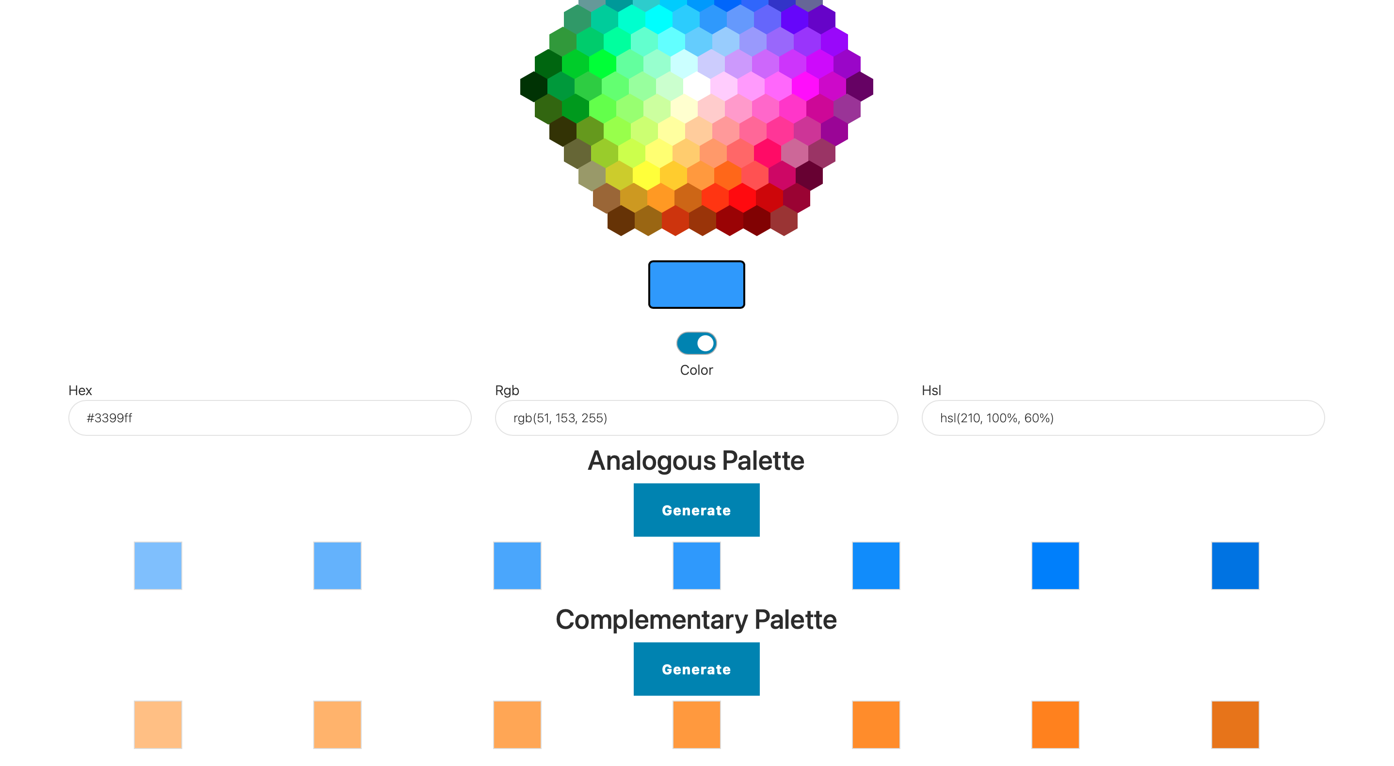
The HTML file for this color picker defines a structured layout to hold all the essential elements like the color display box, color hexagon grid, sliders, and color mode toggles. Here’s a breakdown of the relevant code:
<h2 class="text-centered">Color Picker</h2>
<div id="hexagonPicker" class="hexagon-picker"></div>
<div id="displayBox" class="color-display-box"></div>
<div id="colorBox" class="color-box"></div>
<h2>tag: A header titled “Color Picker” is displayed at the top.<div id="hexagonPicker">: Thisdivholds the hexagon grid of colors. The.hexagon-pickerclass will style it as a grid.<div id="displayBox">: This box displays the currently selected color, providing users with visual feedback.<div id="colorBox">: A secondary box, styled similarly todisplayBox, acts as a color preview for other parts of the interface.
CSS styling
The CSS is crucial in transforming these HTML elements into a visually engaging and user-friendly color picker. Here’s the CSS code with explanations.
The hexagonal grid structure is managed by CSS using a flexible container layout and a hexagonal clipping path for each color cell.
.hexagon-picker {
  display: flex;
  flex-wrap: wrap;
  width: 364px;
  margin: auto;
}
.hexagon-picker: Defines the layout for the hexagonal picker grid. Thedisplay: flexandflex-wrap: wrapsettings create a flexible grid.- Width and Margin: The
widthproperty limits the picker’s size, whilemargin: autocenters it.
Each color cell in the grid is shaped into a hexagon using the clip-path property.
.hex {
  width: 28px;
  height: 32px;
  background-color: #fff;
  margin: 0;
  display: inline-block;
  clip-path: polygon(50% 0%, 100% 25%, 100% 75%, 50% 100%, 0% 75%, 0% 25%);
  cursor: pointer;
}
.hexclass: Defines each individual hexagonal cell.- Dimensions:
widthandheightcreate a basic rectangle that fits into a hexagonal shape. clip-path: Shapes the element into a hexagon, creating the distinctive color cells.- Cursor: Setting
cursor: pointergives visual feedback that the element is interactive.
The display box shows the color users have selected and is styled to appear like a swatch.
.color-box {
  width: 100px;
  height: 50px;
  margin: 20px auto;
  border: 2px solid #000;
  border-radius: 5px;
  background-color: #FFF;
}
.color-box: Used to display the currently selected color.- Border and Radius: Adds a border and rounds the corners for a polished look.
- Background Color: Initially set to white, it updates dynamically based on user input.
JavaScript functionality
JavaScript brings the picker to life, allowing users to interact with the color cells and view their selected colors.
document.querySelectorAll('.hex').forEach(hex => {
    hex.addEventListener('click', function() {
        const color = getComputedStyle(hex).backgroundColor;
        document.getElementById('displayBox').style.backgroundColor = color;
        document.getElementById('colorBox').style.backgroundColor = color;
    });
});
- Event Listener: JavaScript applies an event listener to each hex element.
- Background Color: When a hexagon is clicked, JavaScript retrieves its color using
getComputedStyleand updates the background color of bothdisplayBoxandcolorBox.
The JavaScript code also allows the picker to handle different color models: HEX, RGB, and HSL.
function hexToRgb(hex) {
    let r = parseInt(hex.slice(1, 3), 16);
    let g = parseInt(hex.slice(3, 5), 16);
    let b = parseInt(hex.slice(5, 7), 16);
    return `rgb(${r}, ${g}, ${b})`;
}
hexToRgbFunction: Converts a HEX color code to an RGB format, which is useful when displaying or manipulating colors.- Parsing HEX Values: The
parseIntfunction extracts red, green, and blue values from the HEX code.
To enhance usability, a color mode toggle is implemented. This mode allows users to switch between color and grayscale modes.
document.getElementById('colorGrayScale').addEventListener('change', function() {
    let isChecked = document.getElementById('colorGrayScale').checked;
    toggleColorMode(isChecked);
});
- Event Listener: The toggle switch is tied to an event listener that checks if grayscale mode is enabled or disabled.
toggleColorModeFunction: This function (defined elsewhere) updates the colors displayed in the picker based on the mode selected.
Putting it all together
The combination of structured HTML, detailed CSS for layout and styling, and JavaScript to handle interactions, creates a highly interactive color picker. This tool allows users to explore and select colors intuitively.
In this section, we’ve covered: - The layout for the color picker in HTML, including elements for color selection and display. - The CSS that styles these elements, including the hexagonal grid structure and the color display box. - JavaScript code to handle color selection, updating both the display and mode switch options.
The Color Picker application uses flexible web design techniques to build an interactive, visually appealing tool that can enhance any web-based design process. Let’s continue to explore the palette generation in the next part.
Palette
The palette section of the Color Picker enhances the functionality by allowing users to generate color palettes based on their chosen color. This feature is useful for designers and developers who need coordinated color schemes for their projects. Here’s a detailed breakdown of how the palette functionality works in HTML, CSS, and JavaScript.
HTML structure
The HTML defines two palette types: Analogous and Complementary. Each palette section contains a button to generate the colors and a container to display the palette once generated.
<div class="container">
  <div class="row justify-content-center">
    <div class="col-md-12" style="text-align: center;">
      <h3 class="text-centered">Analogous Palette</h3>
      <button id="paletteAnalogousBtn" class="btn btn-primary">Generate</button>
      <div id="paletteAnalogous" class="d-flex justify-content-center" style="display: none;"></div>
    </div>
  </div>
</div>
<div class="container">
  <div class="row justify-content-center">
    <div class="col-md-12" style="text-align: center;">
      <h3 class="text-centered">Complementary Palette</h3>
      <button id="paletteComplementaryBtn" class="btn btn-primary">Generate</button>
      <div id="paletteComplementary" class="d-flex justify-content-center" style="display: none;"></div>
    </div>
  </div>
</div>
<button>: Each palette has a button to initiate the color generation process. The buttons have unique IDs (paletteAnalogousBtnandpaletteComplementaryBtn), allowing the JavaScript to target them for functionality.<div id="paletteAnalogous">and<div id="paletteComplementary">: These containers hold the generated colors for each palette type. Initially hidden, they become visible after clicking the “Generate” button.
CSS styling
The CSS styles each color in the palette as a square box. This layout makes it easy to see how the colors in the palette relate to each other visually.
.color-square {
  width: 50px;
  height: 50px;
  margin: 5px auto;
  border: 1px solid #ddd;
  cursor: pointer;
  display: block;
}
.color-square: Defines each color in the palette. The fixed width and height ensure uniformity in size.- Border and Margin: Adds a light border and spacing around each square, helping users visually separate each color.
- Cursor: The
cursor: pointerproperty gives visual feedback that the color squares are clickable.
The CSS also adjusts the size of each color square on smaller screens. This ensures that the palette remains usable and visually pleasing on devices of all sizes.
@media (width <= 768px) {
  .color-square {
    width: 40px;
    height: 40px;
  }
}
On screens smaller than 768px, each square is reduced to 40px by 40px to fit more comfortably on mobile displays.
JavaScript functionality
JavaScript handles the color generation when users click the “Generate” buttons. Each palette is created based on the currently selected color, with two distinct generation functions for analogous and complementary colors.
The analogous palette consists of colors that are close to each other on the color wheel. JavaScript generates these colors by shifting the hue value slightly.
document.getElementById('paletteAnalogousBtn').addEventListener('click', function() {
    const color = document.getElementById('displayBox').style.backgroundColor;
    const palette = generateAnalogousPalette(color);
    displayPalette(palette, 'paletteAnalogous');
});

function generateAnalogousPalette(color) {
    let colors = [];
    for (let i = -2; i <= 2; i++) {
        colors.push(adjustHue(color, i * 30)); // Adjust hue in increments of 30 degrees
    }
    return colors;
}
- Event Listener: An event listener triggers the analogous palette generation when the button is clicked.
generateAnalogousPaletteFunction: Creates an array of colors by adjusting the hue of the selected color. The hue is shifted in increments of 30 degrees to obtain similar colors.displayPaletteFunction: Takes the generated colors and displays them in thepaletteAnalogouscontainer.
The complementary palette uses colors that are directly opposite on the color wheel, providing high contrast.
document.getElementById('paletteComplementaryBtn').addEventListener('click', function() {
    const color = document.getElementById('displayBox').style.backgroundColor;
    const palette = generateComplementaryPalette(color);
    displayPalette(palette, 'paletteComplementary');
});

function generateComplementaryPalette(color) {
    let colors = [];
    colors.push(color); // Original color
    colors.push(adjustHue(color, 180)); // Complementary color at 180 degrees
    return colors;
}
- Event Listener: A similar event listener is attached to the complementary button, triggering the complementary palette generation.
generateComplementaryPaletteFunction: Creates an array with the original color and its complementary hue by shifting the hue by 180 degrees.displayPaletteFunction: Similar to the analogous palette, this function displays the complementary colors.
To adjust the hue of a color, a helper function is used that modifies the color properties based on HSL values.
function adjustHue(color, degree) {
    let hsl = rgbToHsl(color);
    hsl.h = (hsl.h + degree) % 360;
    return hslToRgb(hsl);
}
adjustHueFunction: This function takes a color and degree adjustment, converts it to HSL, modifies the hue, and then converts it back to RGB.- Color Conversion Functions: Supporting functions like
rgbToHslandhslToRgbhelp convert colors between different models, enabling precise hue adjustments.
The displayPalette function renders the generated colors in their respective containers.
function displayPalette(colors, containerId) {
    const container = document.getElementById(containerId);
    container.innerHTML = ''; // Clear previous colors
    colors.forEach(color => {
        let colorDiv = document.createElement('div');
        colorDiv.className = 'color-square';
        colorDiv.style.backgroundColor = color;
        container.appendChild(colorDiv);
    });
    container.style.display = 'flex'; // Show the container
}
- Clearing Existing Colors: The container is cleared of any existing color squares to ensure no overlap.
- Creating Color Squares: A new
divis created for each color, assigned the.color-squareclass, and styled with the respective color. - Showing the Container: Once populated, the container is displayed with
flexstyling.
Conclusion
The palette feature in this Color Picker application makes it more than just a color selection tool. It helps users create harmonious or contrasting color schemes for design work. This section covered: - The HTML setup with buttons and containers for the analogous and complementary palettes. - CSS styling for the color squares, ensuring a uniform and responsive design. - JavaScript functions for generating and displaying both analogous and complementary palettes.
This detailed implementation provides a robust, interactive tool for users to explore color relationships and enhance their design workflows.
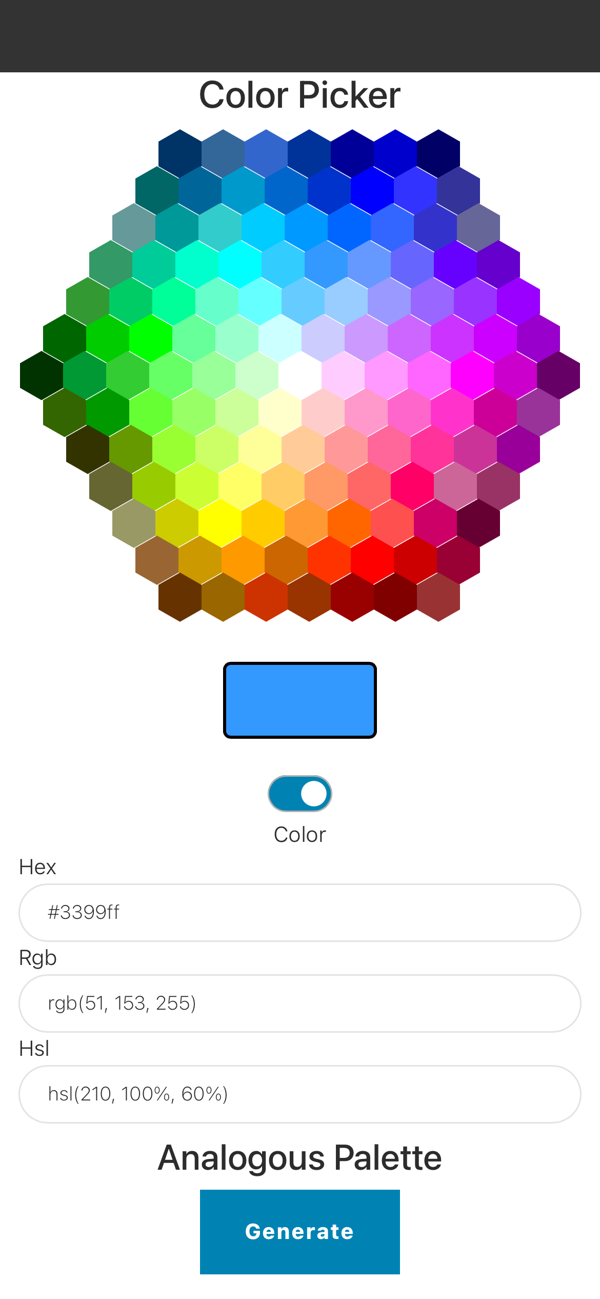
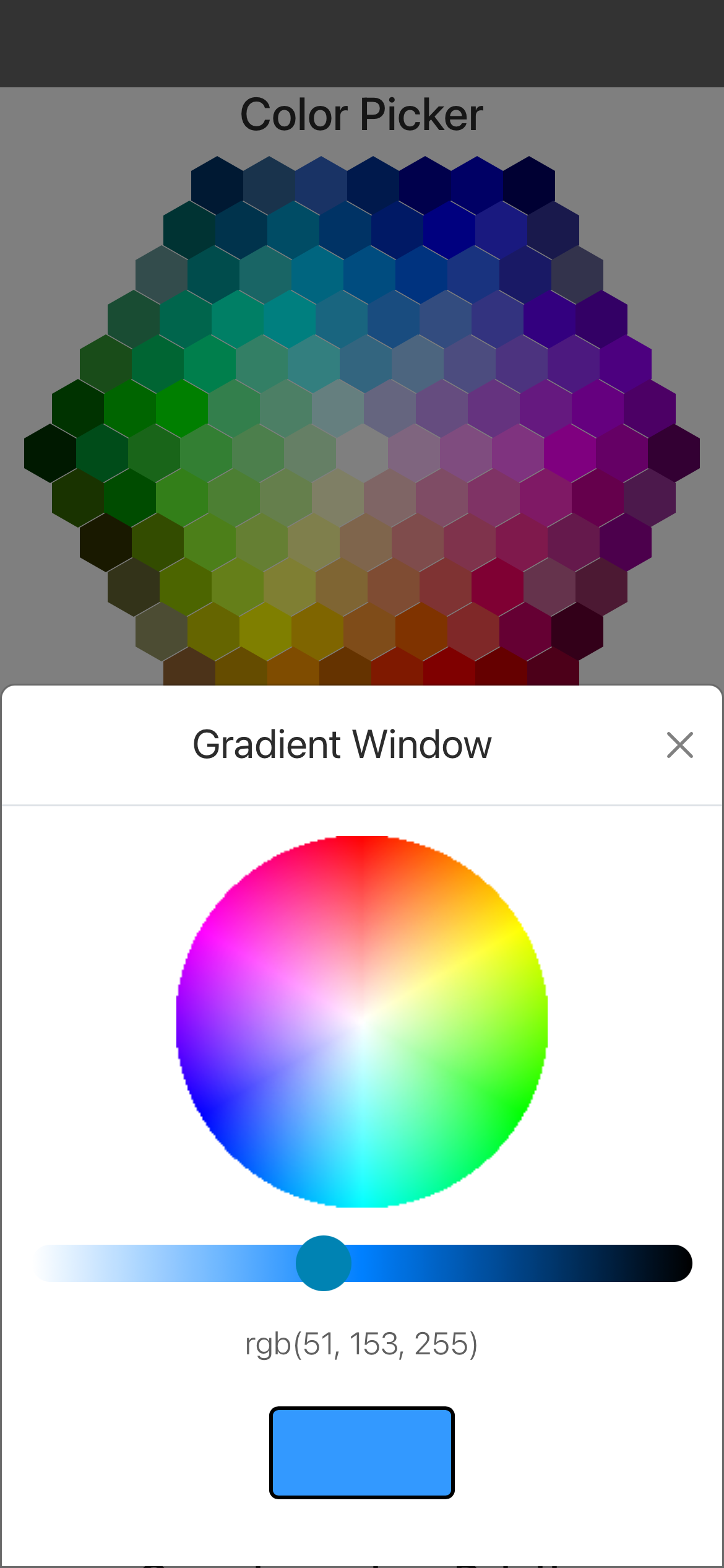
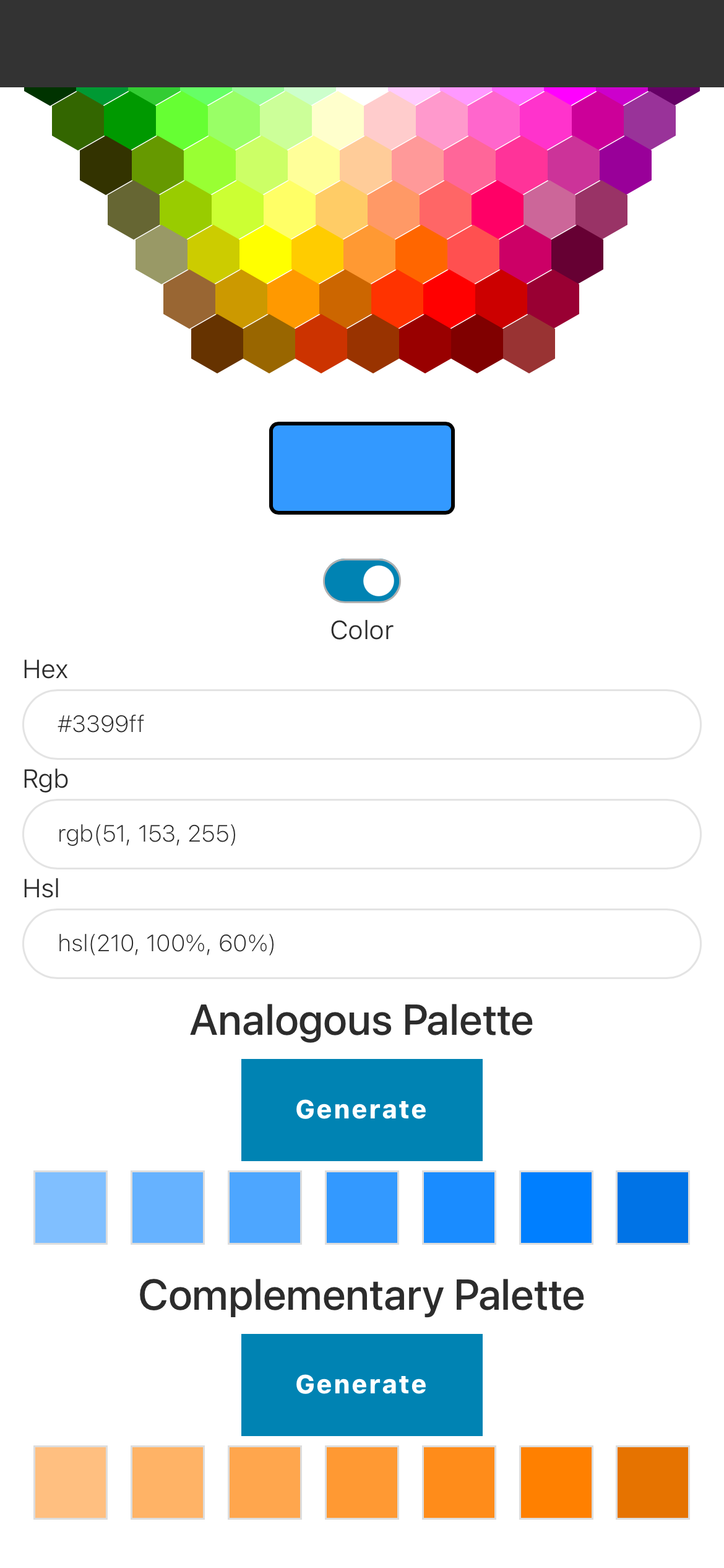
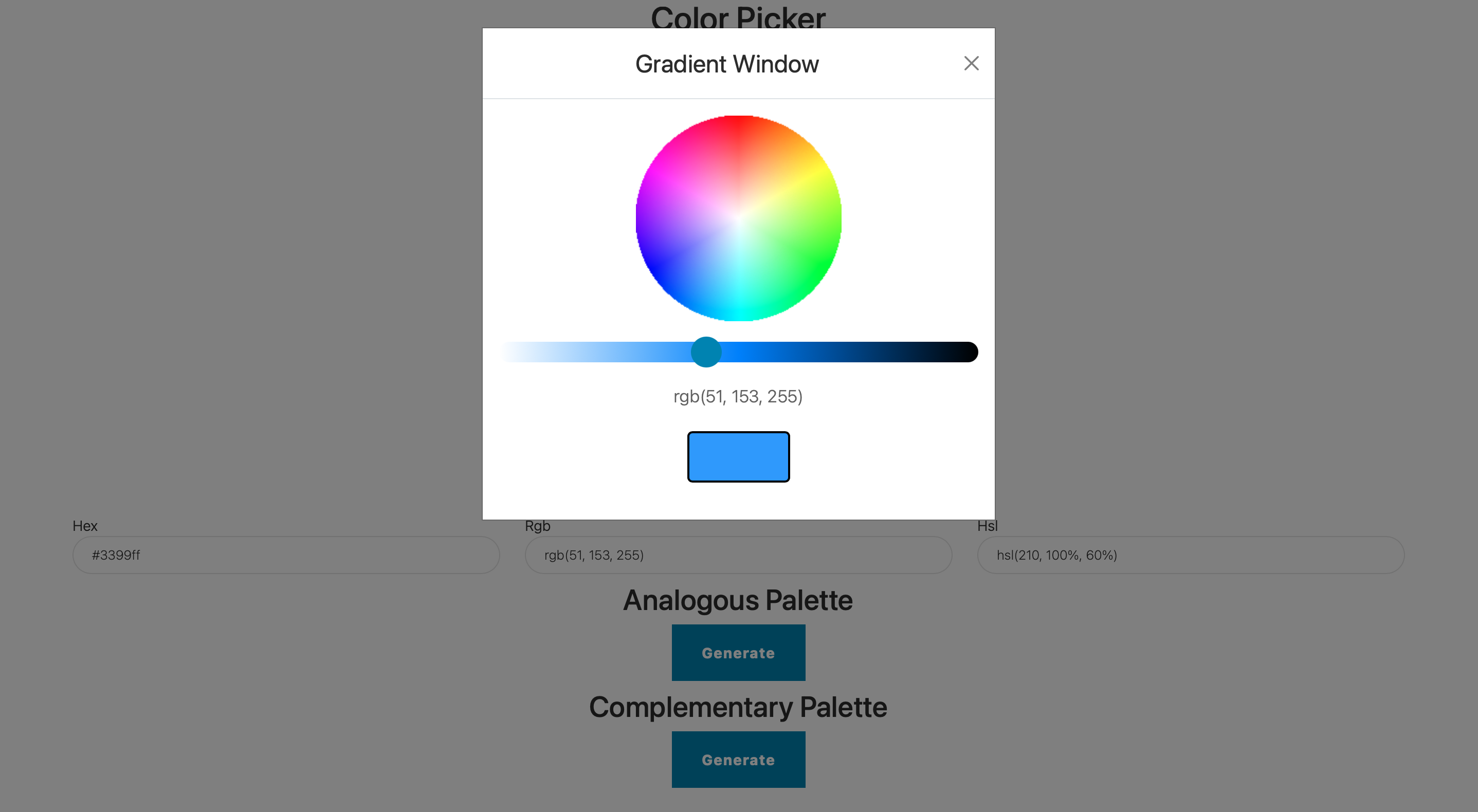
The final results on iOS:
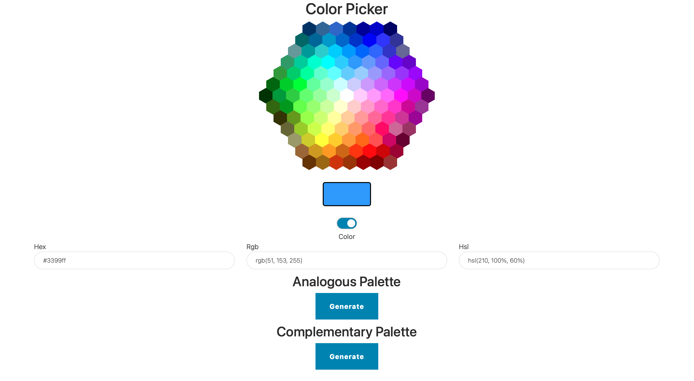
and on desktop:
